|
550 731 01 |
|||||
|
|
|||||
|
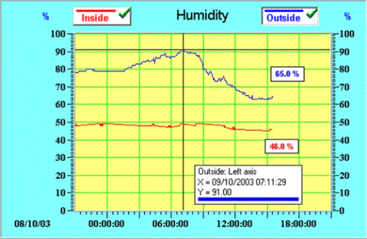
Using a Curve to Display Historical TrendsThe Curve component provides the means to display sampled and previously logged data in the form of a number of individual points (crosses) or individual points joined by straight lines. Depending on the span of the time axis set by the containing Chart component, and the number of points logged within that time span, will produce a historical trend curve on the PC screen. The only setting the user needs to consider is the PhysID of the variable being plotted. The fact that a Data Acquisition component exists within the Visual VIGO design having the same PhysID as that configured for the Curve component, completes the communication link between the Curve and the appropriate databuffer. This means you can have more than one Curve component connected to the same databuffer, perhaps to display the curve in a different form on the same or another chart. Curve component configuration provides the ability to select a line type, thickness and colour, and to associate the curve with the left or right axis of the Chart.
The Curve component is seen as a dual function button within the confines of the chart, and provides many operational facilities to present information about particular aspects of the curve. The first range of functions is invoked by clicking on the button in the area of the curve name. This brings up a small moveable window containing details of the time/date and value of a particular part of the displayed curve. This point is identified by a cross hair cursor positioned on the curve. The position of the cross hair, and thus the information displayed, can be moved using the left/right arrows on the keyboard. Each press of an arrow will move the cross hair by a percentage of the Chart area. By holding in the shift key when pressing arrow keys will move the cross hair between database entries (log points). The second group of functions is invoked by right clicking on the Curve button while it is still selected. This provides a menu for a search of the database to be performed to find the local (on the current display) maximum or minimum value on the curve, or searching the complete database for the same levels. The cross hair and the information box will reflect the result of this search. Should there be further points meeting the same criteria, further searches can be performed using the same process. The third function applies to the area on the right hand side of the button. This firstly acts as an indicator to show whether the displayed curve includes the latest logged data (green tick) or not (yellow tick). The icon can also be clicked, which will deselect the button and remove the curve trace from the chart. This is shown with a red cross. Clicking the icon again will re-establish the curve within the current area of the chart. When a curve is being plotted on the screen, it will initially be structured using the logged data from the database. However, the final point will show the last sampled value if this is within any threshold value set, even if that point may not finally be regarded as a logged value. This means that real time plotting is occurring (like a chart recorder), and the plot will continue to be shown in this way until it is redrawn due to manual zooming or scrolling. When this occurs, the plot will use actual historical log points to redraw the curve and real time plotting will continue.
Related TopicsDisplaying Plotted Data on a Chart
|
|
|||